By Luke Battye
McDonald’s BIG problem
“The reality is our recent business performance has been poor. The numbers don’t lie” — Steve Easterbrook, CEO McDonald’s, 2015.
Back in 2015, McDonald’s was struggling. In Europe, sales were down 1.4% across the previous 6 years; 3.3% down in the US and almost 10% down across Africa and the Middle East. There were a myriad of challenges to overcome. Rising expectations of customer experience, new standards of convenience, weak in-store technology, a sprawling menu, a PR-bruised brand and questionable ingredients to name but a few.
Breaking through the limits of value-engineering
McDonald’s are the original fast-food innovators; creating a level of standardisation that is quite frankly, remarkable. Buy a Big Mac in Beijing and it’ll taste the same as in Stratford-Upon Avon.
So when you’ve optimised product delivery, supply chain and flavour experience to such an incredible degree — how do you increase bottom line growth? It’s not going to come from making the Big Mac cheaper to produce — you’ve already turned those stones over (multiple times).
The answer of course, is to drive purchase frequency and increase margins through new products.
McDonald’s Achilles heal: Status quo bias
Numerous studies have shown that no matter what options are available, people tend to stick with the default options and choices they’ve made habitually. This is even more true when someone faces a broad selection of choices. We try to mitigate the risk of buyers remorse by sticking with the choices we know are ‘safe’.
McDonald’s has a uniquely pervasive presence in modern life with many of us having developed a pattern of ordering behaviour over the course of our lives (from Happy Meals to hangover cures). This creates a unique, and less cited, challenge for McDonald’s’ reinvention: how do you break people out of the default buying behaviours they’ve developed over decades?
When a Big Mac Meal with a chocolate milkshake is what I order, and have done for 20 years, how do you drive another £1 spend with me?
Welcome to ‘The Restaurant of the Future’
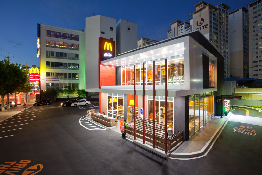
Image source: independent.co.uk
Their response to this, along with the other challenges outlined, has been McDonald’s restaurant of the future concept. McDonald’s are now back in growth and this format is widely hailed by Wall Street as central to that turnaround. Home delivery, table service, self-service ordering, in-store technology upgrades and of course new products and menu techniques.
The following article breaks down its features and tries to show some of the psychological mechanisms that underpin its success.
What outcomes does the new format need to deliver?
In its simplest sense, the new format is designed to improve customer experience, which will in turn drive frequency and a shift in buying behaviour (for some) towards higher margin items. The most important shift in buying patterns is to drive reappraisal of the Signature range to make sure they maximise potential spend from those customers who can afford, and want, a more premium experience.
1. Arrival & entry
Decision-anchoring
On arrival to any McDonald’s now you’ll see their signature range promoted. No pricing information, just succulent imagery. This leverages a research insight that the first options we meet when making a decision, tend to be the ones we end up choosing.
Studies have shown in the US that when people pick up food from a buffet station, 70% of the time they fill their plates with the first 3 items they come to. Why? All subsequent choices are compared to the initial reference point.
So for McDonald’s to drive changes in buying habits, they need to take control of the first choice that makes it onto the consideration list.
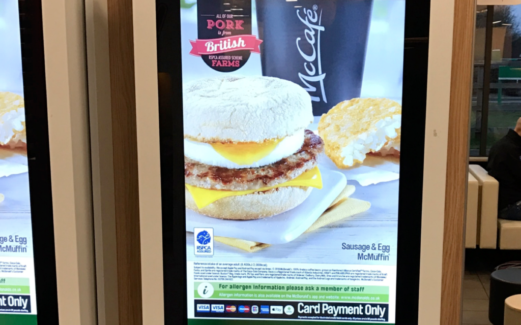
Looks great, but where’s the price?
Reducing psychological pain
Spending money feels psychologically painful. We tend to weigh the tangible relative loss of something (in this case money) more than we value the intangible equivalent gain (the food experience).
When you walk into a McDonald’s, check out the promotions inside and out. No pricing information. Just beautiful imagery that gives us the psychologically smooth, care-free experience of choosing without considering the ‘loss’ impact of our choices. Feels good right? Just choose the picture you like.
2. Choosing: The McMenu, the world’s most popular, and least explored user interface
With an estimated 1% of the world’s population set to eat McDonald’s today, we’re looking at around 2.3 billion people eating McDonald’s every month. Let’s take stock of that for a moment. Facebook has just over 2 billion monthly users.
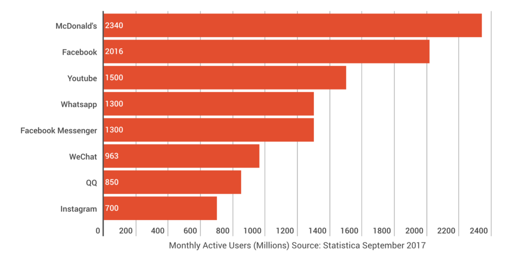
OK so social platforms get more actual views, but hey, it’s still staggering the amount of interaction McDonald’s interfaces get.
There is a lot of analysis available about the UI and UX of the world’s most popular digital platforms — but comparatively little is out there on the choice architecture embedded in the interfaces and in-store interventions that 2.3 billion people experience every month. Let’s dive in.
Attention cues
With an eye-watering investment in digital displays across their stores, McDonald’s use animated cues to draw attention to specific items. Watch an example here. Notice the low frequency of animation around the traditional “Extra Value Meals” in the example video.
Our eyes detect colour, shape, texture, detail really well when we are directly gazing at something. The magno cells in our retina are weak at detecting these features in our periphery, in favour of a strong ability to detect motion (to helping us spot danger before it’s too late).
The animation on these screens take advantage of this fact to involuntarily capture our attention and activate a saccade (eye movement) towards the target (products that aren’t the traditional items). The result? We scan a wider variety of options when choosing and these naturally fall into our consideration set as a result — helping to fill the working memory ‘basket’ with new options we might not have considered before.
Designing for working memory
Generally speaking, we can hold 7 ‘items’ in working memory at any one time. What’s important is that we fill working memory with the right options if we want to drive some people to switch out of their learned behaviour.
Menu categories are chunked into lists of 6–7 but more importantly, the main menus use just 6–7 focus items. Just 1 of these focus items are our traditional options, helping increase the odds that the other 5 or 6 items are chosen.
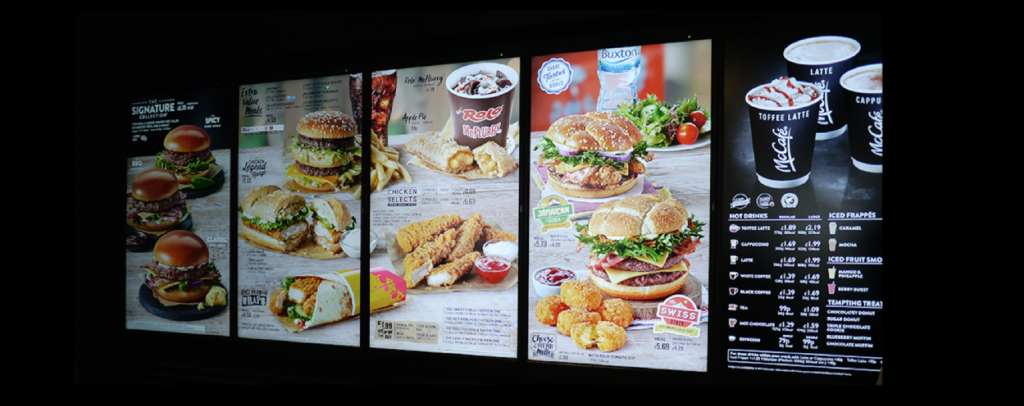
New digital menu formats: notice how the traditional meals (now called Extra Value Meals) take up only 15% of the display space
Choice architecture & shifting defaults
What’s really interesting is when you look at the choice architecture that sits behind these interfaces. If you now look at a McDonald’s menu, you’ll struggle to find the ‘traditional’ value meals we all grew up with. We’ve gone from the Big Macs, McChicken Sandwiches and happy meals as the most recognised features of these interfaces to an altogether new selection of choices.
Menu real-estate also tells an important story. Approximately 30% of the digital screens are filled with the new Signature meals. The traditional options now take up just 10–15% of the total menu display space; items that the Pareto Principle would suggest generate circa. 80% of historic orders.
Importantly, these meals represent a circa. 35% higher in price than the traditional “Value Meals”. A large big Mac meal is £4.49 with a large Signature meal costing £6.69 (35% higher spend per head).
This additional revenue is protected further at the medium bracket meaning even if a customer switched but didn’t want to go large, McDonald’s will still clear the £1.80 additional revenue (an uplift of 40% spend per head).
McDonald’s play with the scale and salience of specific target items to shift the perceived norms of ordering in an attempt to shift defaults.
Using Gestalt principles to drive attention
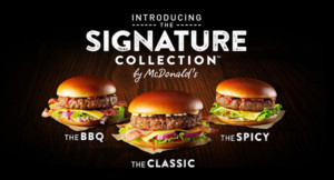
Three choices, visually identical. Image source: McDonalds.com
The only similar looking items on the above menu, are the signature items. 3 similar looking burgers creates a visual pattern that takes advantage of our natural propensity to view similar items as a ‘single unit’, helping nudge our attention towards the ‘pattern’ these similar products create.
The impact? This visual device creates another cue to drive attention to the items they want to make a focus of the decision making process.
Decision framing: Variant pricing
Product variants are positioned as price variants instead of showing the full price of the item. This changes the feel of the decision from spending £3.69 for a Egg and Bacon McMuffin, to just another 40p to add bacon to my Egg McMuffin. Psychologically this 40p up-sell feels like a ‘no brainer’ decision vs. the alternative of spending £3.69.
Price anchoring
The effect of all this focus on Signature meals at a 35–40% premium? Your frame of reference for spending gets anchored at a higher level and this create two outcomes for customers not switching out of their default purchase.
- When you spend money on a traditional item, it will feel cheaper because the premium products have created a new reference.
- Secondly, it will likely drive up the number of people ‘going large’ when buying traditional items as people feel good that they still aren’t spending as much as they could have if they bought the premium offerings
Managing cognitive dissonance
We all know fast-food is bad for us and yet we still rock up in record numbers. When we buy any fast food we experience psychological discomfort known as ‘cognitive dissonance’. This is where our beliefs (this is bad for me) is in contrast with our behaviour (I’m still going to buy it).
This likely leads to buyer’s remorse, guilt and maybe a sprinkling of shame, all of which negatively colour our memory of the experience. In turn this will impact how long we will wait before returning. Let’s see how McDonald’s’ try to tackle this.
The health halo effect
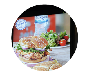
Notice no pricing or product information for the salad
Research has shown that the mere presence of healthy options ironically leads us to make more indulgent choices. Even with just a single healthy option shown on the menu (that I would bet very few order), customers perceive the overall ‘health-index’ of the menu to be better, and therefore feel less guilt buying the items that best fulfil their desires.
It was interesting to see at one location recently the presence of a photo of a bottle of water and salad on the menu, with no pricing or ordering information whatsoever.
Impulse upsells
Finally for those people who still aren’t sure what to order when they get to the front of the queue — a helpful up-sell is presented. In this example, no pricing information and the highest priced breakfast meals are used as the cue.
3. Ordering & collection
A complete redesign of the order and collection experience involves chunking the experience and offering new tools. Here’s a run down of how they work.
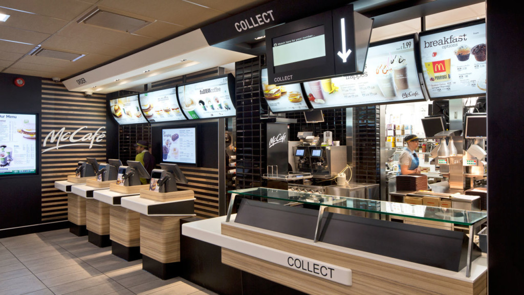
Splitting ordering and collecting: do two queues feel better than one? Image source: Dailymail.com
Experience chunking: Two queues feel faster than one
In the ‘old format’ system, you ordered, paid and collected from the same till, which creates some interesting challenges. It was unclear where to queue because a) there were no clear visual boundaries to each queue, b) which tills were actually manned wasn’t clear when staff move around to fill orders, and c) knowing where to wait for your order was always left to the individual to decide, without guidance.
One of the most exciting innovations that they now employ is queue chunking. This where they break up the order queue and collection zone. This has two important effects: it improves operational efficiency because our order takers and collectors have a more focused set of routines to master.
The second is how this impacts our memory of the queuing experience. Our experience of ordering feels faster, because it is — our server is focused purely on order-taking which means less time per customer, and faster queues. We quite literally spent half the time in a queue than we had previously.
When we wait for collection, this feels faster too (our server isn’t burdened with taking orders). We no longer queue but wait for our order number to be called. This changes our memory of the speed of the first queue.
The reality is this speed increase is probably more psychological than it is material. By chunking the queues they break the experience into two discrete chapters. We move to a new physical location and wait for our number to be called. When we reflect back on our experience we remember the collection queue speed, not the ordering + collection, leaving me with the memory that getting my food felt faster.
Wait-time feedback
We’ve done a fair amount around queuing psychology and one factor that makes for a longer feeling queue is not knowing how long it will last. Disney are experts at this, routinely telling guests their wait time is longer than it so so they have the consistent experience of queues feeling faster.
McDonald’s now employ a ticket system which helps the individual understand where they currently sit in the line, reducing the anxiety of not knowing how long they will have to wait, creating a psychologically better queuing experience.
Self-service: Shifting the locus of control
Using self-service to give the guest control over the browse and order time frame, rather than being subject to the speed of the queue. Rather than feeling rushed or perhaps pressured to make a decision, guests are given full control over the ordering and customisation of products. This feeling of control that self-service gives enhances our experience by reducing interaction anxiety.
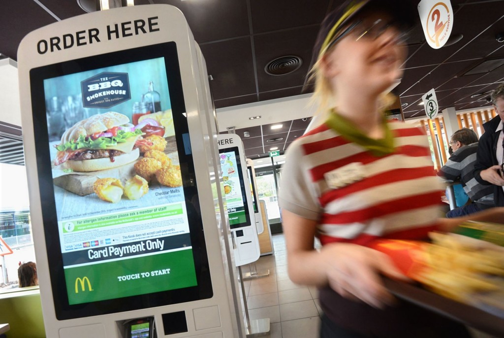
Image source: manchestereveningnews.co.uk
Table-service & the human touch
What I love most about the introduction of table-service is that it draws on cross-category convention to change the perceived quality of the experience. Table service isn’t something that happens in fast food restaurants and I commend McDonald’s on using this new technology to free up humans to do what they do best: interact with other humans. Using the self-service kiosks customers can now request for their meals to be delivered to their table.
McDonald’s could quite easily use this technology to drive up margins by reducing staff count, instead they are redirecting that human capital to add value to our interactions and elevate the overall service experience.
4. New service experiences
Driving delivery speed through the mobile app
The introduction of mobile ordering allows guests to order before they arrive, ‘checking in’ as they arrive by scanning a code which triggers the payment and order.
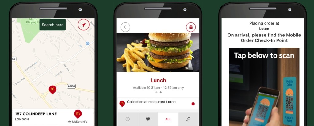
Order from mobile, check-in by scanning which triggers the order to the kitchen. Image source: 9to5mac.com
Order from mobile, check-in by scanning which triggers the order to the kitchen
Much like the queuing chunking, breaking the order and collection moments makes for an overall faster feeling experience by removing the order moment from the in-store experience.
Driving frequency with home delivery
The introduction of home delivery in certain locations also helps drive frequency by expanding the number of occasions we associate McDonald’s with.
Whereas before we might only associate McDonald’s with treats when we are out and about, now we can start to build a pattern of behaviour for treats when we don’t want to leave the house.
The impact?
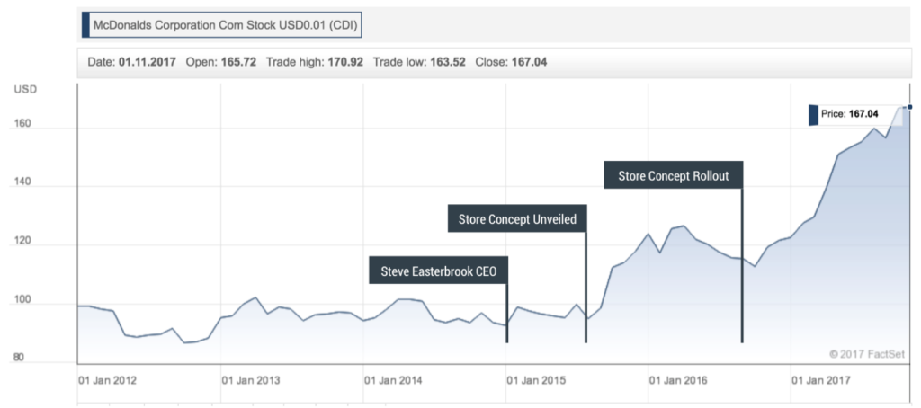
Shares are up 50% over the last two years. Wall Street’s happy — and customers are too. The new experience is faster, feels faster, the environments feel more premium and the new menu items taste great. A tremendous execution of a wide-variety of psychological phenomena to build an innovative new product and service experience. So what can we learn from this? By January 2018 McDonald’s share price has increased circa. 50%compared to the previous 24 months.
How might a restaurant apply these principles to help people make healthier choices?
No one goes to McDonald’s because they want to get healthier – the utility to customers is hedonism, not health. What’s more, the health halo study above shows that increasing focus on healthy eating in a McDonald’s may well increase purchases of less healthy items.
But there are plenty of organisations who want to shift behaviour towards a longer-range health outcome. Let’s see how they might translate McDonald’s strategies.
4 principles for brands wanting to deliver better health outcomes for customers.
- Define the ideal ‘basket’: First step is defining what your target buying behaviour looks like. Is it adding a healthier product to an average order, focusing on a specific healthy range or perhaps a driving purchases of a cluster of products?
- Focus attention: The first things we see tend to be what we choose. Consider how you might make sure your ideal basket is the first thing customers notice when exploring options. Size, layout, motion – all can be used creatively to place your target basket as the reference point for other options.
- Set flavour expectations: When McDonald’s tells you the burger is juicy, you’ll probably experience it as juicy too. When we’re told what flavour to expect, our experience tends to fall in line with that unless there’s a serious mismatch. In the context of healthy options, language matters. Using words like light, fresh or seasonal will tend to driver better flavour expectations than ‘healthy’.
- Frame buying decisions: Consider how you might use perceived norms (e.g. all meals come with salad) structured upsells (add a banana for just 59p) or even reduced portion size options (minimise rather than supersize) to make it easier for customers to make ‘system one’ decisions about healthier options.


